Thursday, November 29, 2012

Final Residential Project: Philly Loft

For a while this semester, I've felt like I've been just trying to stay afloat. I've been getting my final grades back and it seems like things are starting to fall into place. It's a weird feeling to realize that I might actually be swimming now! 

It's kind of been a cool process because I can look and see how much better my work is getting and it makes me so proud of myself and how hard I've worked this semester. 

I've always thought I wanted to do Residential Design and so it's been fun for me to take this as a class and I've really enjoyed it. This last project is almost exactly what I'd like to do. We took an apartment shell, space planned the whole thing then picked out furniture, finishes, and decorative items for three of the rooms. It was fun but extremely time consuming.


Here are the project requirements:


The Client

The Park family have recently moved from Korea to the US for husband Chan's work with a large auto manufacturing company. They will be designing a home in this new apartment complex in Philadelphia and were impressed by your work. The family includes wife Mikyoung, and her father Yong Hwa and mother Shin Hye. Chan and Mikyoung plan to have children, but not right away. The husband also has elderly parents who could benefit from sharing the new home. They are all independent people who require privacy, so separate entries are necessary for the main unit and parents' unit.

The couple has a good income but little in the way of savings. The parents have the necessary capital to buy the units and finance the down payment. Though they are currently in perfectly good health, it is important for the parents' apartment to be accessible. A layout consisting of side-by-side units with separate but related entrances are necessary. The family's aesthetic is traditional eclectic. You may mix multiple historical styles and may make use of historically-inspired contemporary furnishings. Use care in mixing multiple styles that you pay attention to scale, proportion, form, etc. so that everything, while diverse, goes together. You can use the Connected Lines Furniture Style Guide to help you.

Parents' Unit: approx. 750 sq ft

  • A combined kitchen/dining/living space with a media wall and shelving for books or additional storage
  • Bedroom with sitting area, closet space for two, desk, shelves
  • Laundry space
  • One bathroom

Main Unit: approx. 1500 sq ft

  • Combined kitchen/dining/living space with a media wall and shelving for books or additional storage
  • Master bedroom with sitting space and closet for two
  • Two bedrooms for guests, adaptable for future children
  • Study/office
  • Laundry
  • Two bathrooms


Deliverables

You will present a digital presentation in a format of your choosing. Give careful consideration to how the presentation is organized, what information should be provided, and how a reader will navigate what is provided. Presentation to include:

  • Furniture plans for both units with a graphic scale executed in a method of your choosing
  • High quality digital samples of finishes with identifying labels for Master Bedroom, Living OR Dining, and Kitchen OR Bath in Main Unit ONLY:
    • Floors, walls and ceilings
    • Window treatments
    • Furniture fabrics/finishes
    • Decorative lighting
  • Estimated budget for three rooms chosen above, using the prices published in the Interior Designer's Portable Handbook


Since this was a digital presentation I'm putting the whole PDF on here if anyone is interested in looking at it. You can't do it on your phone...only a computer but it's kind of fun to flip though!


                     Open publication - Free publishing - More floorplan


If you are on your phone or don't want to look at the whole thing, here are a few highlights!


Also, we had to do a budget and if you were wondering, my budget came out to $84,094.57 (including construction). Here is my budget breakdown if you're interested (or if you want to see where any of the furniture came from)


                      Open publication - Free publishing - More budget


xoxo,


Thursday, November 8, 2012

Some Recent Art Work! (aka hey look at me!)

This is my "Hey look at me" post so please humor me! I haven't really shared any art projects that I've done since I've been back since Italy but if you think that means I haven't done much then you don't know me very well ;) 


So without further ado here is some projects that I've done lately!


A Thomas the Train cake for Collins' second birthday!


Reversible bubble skirts for Dagny and Lydia! The pattern is from Lil Blue Boo and fun fact - the purple and yellow plaid fabric is from a sarong from Lauren and Patrick's honeymoon :)


Dad helped me build this faux wooden pallet and I painted the quote from The Help on it for Jani and my "friend-aversary" 


Obviously from this summer but this is what happens when people let me draw on their chalkboards!


I used one of Collins' John John patterns to make this for his birthday! The cuff at the bottom is made from an old tie.


I LOVE how this dress for my friend's daughter turned out. I altered this Oliver + S pattern and the fabric is just from Jo Ann's!


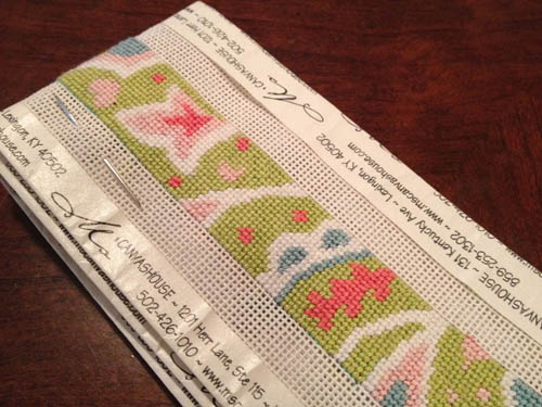
Only slightly sketchy pictures ;) I was supposed to have this needlepoint belt made for Michael's graduation...but that didn't happen. Finished it up during my Italy trip!


And speaking of needlepoint...here's the belt I'm working on for myself. One day I'll finish it!


Another name art...started a last year for Brittany's birthday but I finally finished it up for her this year. (One day I will get them up on my Etsy site...when I finally get my Etsy site back up in the first place...)


Just some quick hair bows for Dagny and Lydia for Halloween!


I was workout Barbie for Halloween and I needed pink sparkly shoes so why not make my own?? Basically you just Modge Podge the shoes, sprinkle glitter on top, and seal them when they dry. Unfortunately, I somehow picked the cheapest shoes from the thrift store and the bottom of my shoes literally disintegrated but they looked good for the night!


Completed another thing off my 2012 list - learn to smock! I'm currently working on a Christmas insert for some overalls for Collins...don't have much done though :)


Just some proof that I actually do school work. These are some gray scale renderings that I've done throughout the semester. It's just pen with marker on top.


This was another finger painting that I did in my art journal. The tutorial/inspiration was from Alisa Burke.


This is what I actually do during lecture classes :) Anyone picking up that I love song lyrics?


I was trying to use up some fabric scraps that I had so these pants were born for Dagny's 4th birthday! The pattern is from Oliver + S (they seriously have the best patterns!)


And last but not least...made these brownies for our election party on Tuesday. No comments on the results but the brownies turned out well. All I did was trace the designs on a small piece of cardstock then cut that out with an exact-o to make my own stencil. You just put that on the brownie then sprinkle powdered sugar on top!


Hope you all enjoyed my mini art show :)


P.S. Has anyone seen the other half of this blog?? I'm declaring her MIA! :)